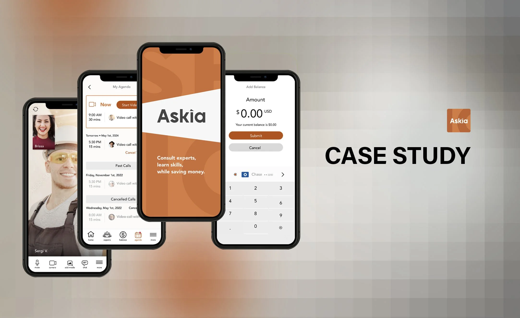
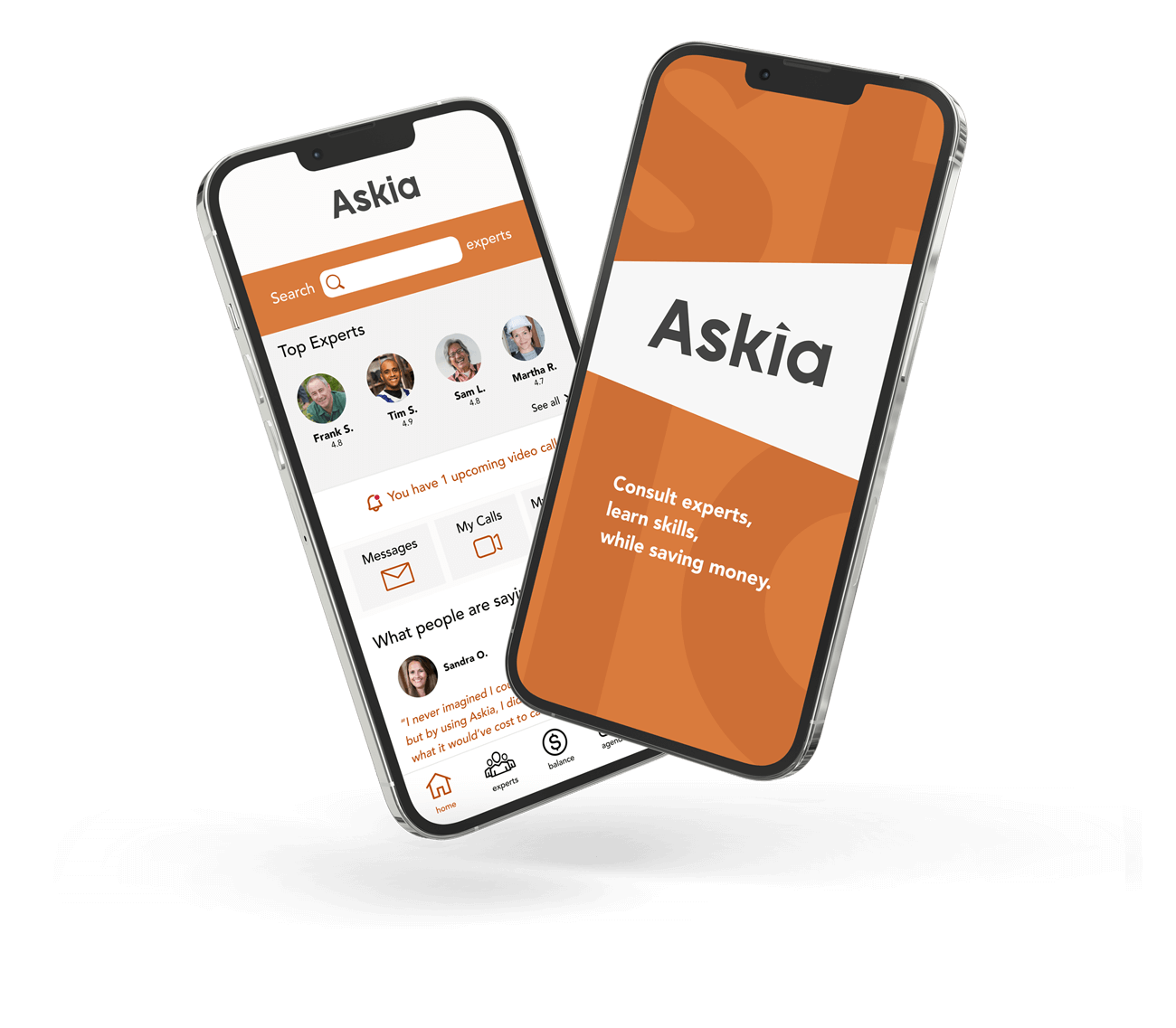
Askia is a responsive web application I designed for the DIY home improvement and services industry. It provides homeowners and DIY enthusiasts with 24/7 access to vetted experts in the home improvement field through live chat or video calls. These experts are available to answer specific questions related to ongoing or planned projects, ensuring timely and professional guidance throughout the process.
Overview
Course duration (12 months )
Duration
Context
This is the final project of my Career Foundry UX Immersion Course.
UX Writer
UI Designer
UX Designer
UX Researcher
Role
Tools Used
Problem Statement
Going into this project my initial hypothesis was that DIYers and new home owners (especially the DIY type of home-owner), in order to lower cost, always seek out practical approaches when tackling home improvement projects related to general construction, landscape design, wood-working, electricity, plumbing, handy-work, etc. for their homes and/or businesses. And while there are already some products out there, such as YouTube, that a large number of people around the world use to find guideance on projects, I wanted to create a different product that placed emphasis in obtaining much more personalized help for specific projects by obtaining tips from vetted experts in various home improvement fields in order to meet the many needs that aren’t being met with what’s already out there.
Possible Solution
Create an app that connects home owners and DIYers seeking advice on home improvements with experts that can help by:
Chatting within seconds via text audio and video messages.
By enabling live audio and video calls between users and experts
By enabling file sharing while keeping discussions to always stay private with the guarantee of privacy and security.
My Process
For this case study I used the Design Thinking process, broken down into a model of five stages as shown below:
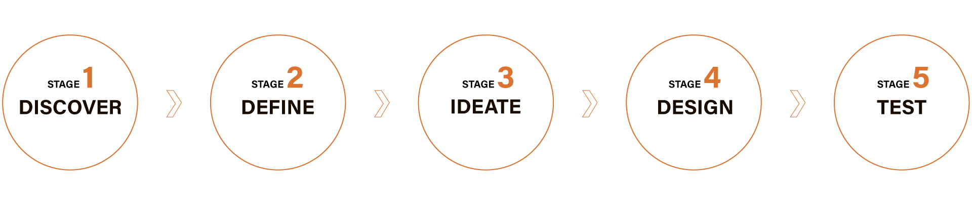
Stage 1. DISCOVER | Competitive Analysis
What’s already out there?
I started by identifying two potential competitors, which I analyzed by creating a SWOT and marketing profile.
Stage 1. DISCOVER | Research
Who?, What?, Why?, How?, When?…
For research, I prepared initially by identifying my research goals in order to help me narrow down and focus in on the relevant needs of my product.
Some of the goals were to collect information such as user behaviors when performing certain tasks, their attitudes towards specific problems, their needs and opinions regarding sites they liked or caused them frustrations, etc.
I then chose my research methods (surveys and remote-in person interviews) for the research, wrote my script, recruited research participants, interviewed them and gathered my data.
Stage 2. DEFINE | User Personas
So, what’s the best approach?
After collecting my research findings, I realized there was indeed vast potencial for my product and that I could create a product that kept their needs in mind. So to tie it all in, and begin designing a MVP, I created proto-personas to represent my target audience and user flows for each proto-persona to represent the journey each user would take to get from point A, to point B in the app in the most streamlined way.
Stage 2. DEFINE | User Journeys
The journey begins
For each user journey each proto-persona had a unique hypothetical scenario assigned that represented their goals and skill level within the app. I wanted to “step in their shoes” and visualize how they’d complete tasks inside the app.
Stage 3. IDEATE | User Flows
Time to play!
Once I had my proto-personas I divided them into novice, intermediate and advanced users. This allowed me to divide and organize tasks in three different levels of difficulty, always aiming to stay empathetic and maintaining focus on their unique perspectives. These user journey also helped me prioritize core functions and narrow them down to three to start developing my MVP.
Stage 3. IDEATE | Card Sorting
Now, what goes where?
After creating my user journeys I went conducted a remote hybrid card-sorting exercise amongst 6 participants using OptimalSort, which made the exercise easier than in person for a number of reasons. The card sorting exercise uncover helped me architect information by putting it together into a site map.
Second and last version of my sitemap
Stage 4. DESIGN | Wireframing
The fun part
Once the initial research phase was over and I’d developed my sitemap, I moved on to the visual aspect of the design. I started with paper wireframes to depict screen sequences necessary for my three basic functions conveyed in the user flows for the mobile and desktop versions.
Some mobile and desktop wireframes.
Stage 4. DESIGN | Prototyping
After creating my paper wireframes and feeling more confident of the direction to take, I translated them into mid-fidelity prototypes and then a clickable high-fidelity prototype.
Some mobile and desktop prototypes.
Stage 5. TESTING | Usability Testing
Fingers crossed, here we go.
Once my first clickable hi-fi prototype, It had to put it to test. Before testing I developed a concise test plan which included which testing methodology to use, objectives, goals, questions, a script to follow, tasks to test, and metrics to classify errors to name a few elements of my entire plan. I then conducted moderated in-person tests amongst 6 participants.
Usability Test Conclusion
Conducting this test allowed me to see very valuable aspects of the prototype from a different perspective, which I’d not seen before as designer. Additionally, it allowed me to gain a better understanding of why its a vital part of the entire design process. I also grew a bit more confident and a interested in how to perform and interpret the results acquired once the tests were finalized.
After completing the usability test, I uncovered some biases I had and realized the information architecture which I had originally designed needed to be revised and changed a bit. So, I organized the main problems by severity level and worked out solutions which were implemented in the next iteration of my prototype.
Back to the Drawing Board…
The images below showcase the evolution of some the onboarding screens. Part of the process to refine these screens included some A/B tests with participants through usability tests, which helped me discover what blind spots I had, and was able to polish and simplify them to make them more attractive. Afterwards, I increased their fidelity furthermore until I was pleased with them.
Snippet of my A/B test
Paper onboarding wireframes
First iteration of onboarding prototypes
Second iteration of onboarding prototypes
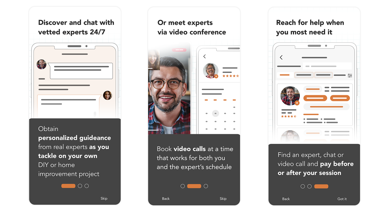
Third and last (for now) iteration of onboarding prototypes
Is it a Wrap?
For the latest round of iterations, I tested my prototype with students in the Career Foundry community. That phase helped tremendously and I implemented revisions to fine-tune my prototype. However, I still plan on continuing improving the prototype. The next steps of the process entail designing screens to add payment methods, mock up what filters would look like in the Browse Experts screen, create the Edit my profile, FAQ, Support, Buy Gift Card, and the Video Settings screens and develop my MVP a bit further for testing before the hand-off to developers phase comes.
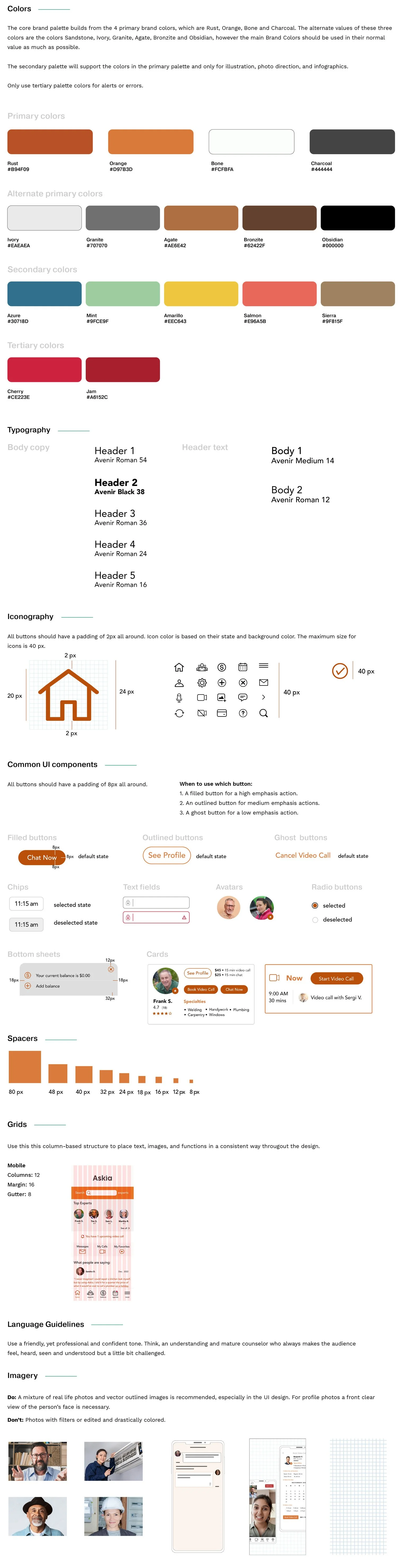
Style Guide
In order to ensure continuity throughout my product's design, I created the style guide below. It should help define elements like typography, colors, layout, and components that are approved to be used in accordance with brand guidelines.
I chose orange as the main brand color because it is, at least in the US (where this app would originate from), commonly perceived as a color associated with construction and ensuring the safety of others. However, when I tested the orange it was violating color contrast principles mentioned in the WCAG, so I had to increase contrast and I replaced most elements in my UI with the color Rust to ensure accessibility.
A more comprehensive style guide for the team designers and developers is available. What you see below is a short version for portfolio demonstration purposes.