Propps Case Study
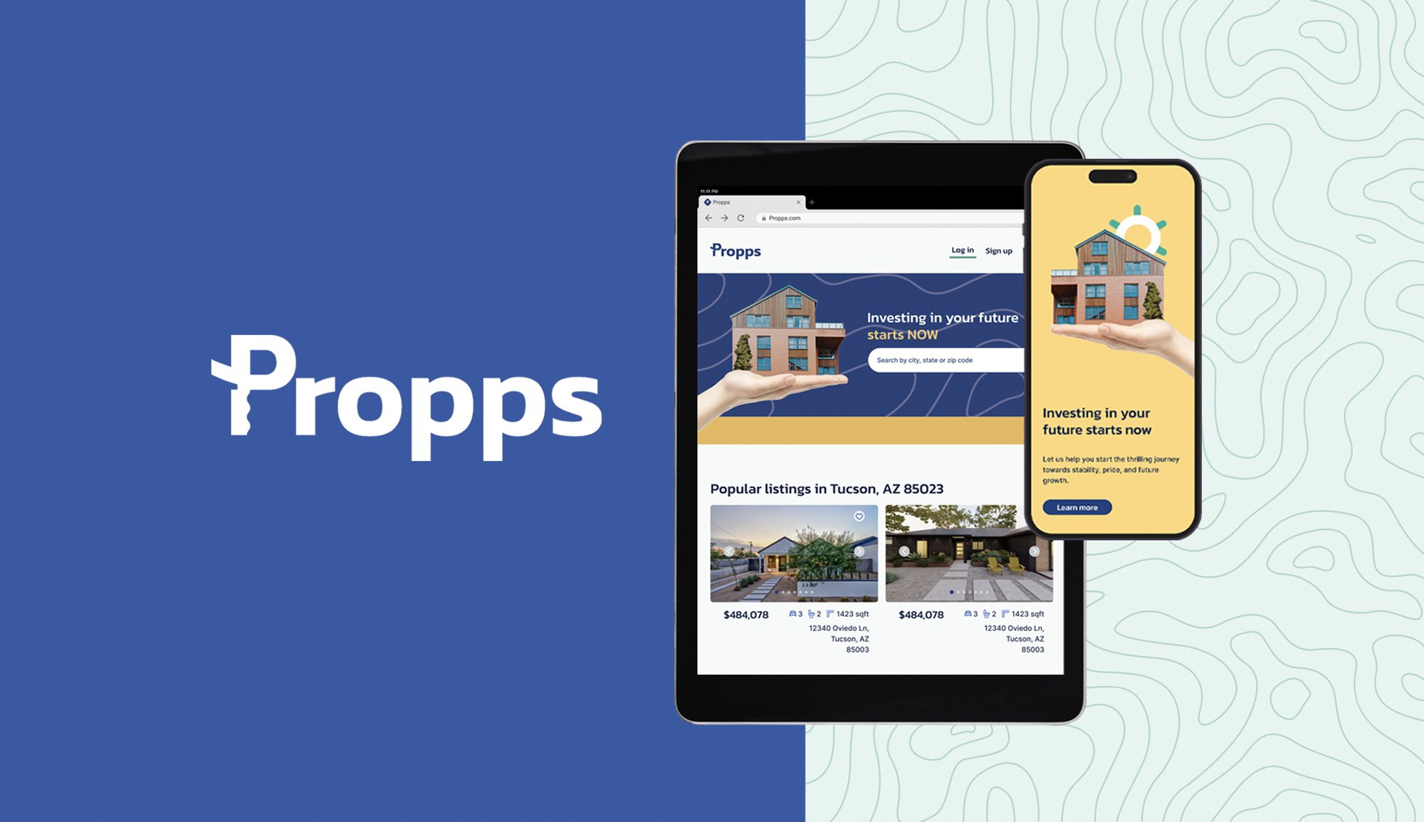
Propps is a responsive web app for new property buyers looking to invest or gain more financial security.
Role: UI designer
CONTEXT
As part of my UI specialization course with Career Foundry, I chose to work on the development of the UI of a real estate product. To begin the project, I was provided with the project brief, the user persona and user stories.
01. OVERVIEW
PROGRAM TIMELINE:
2 months
TOOLS USED:
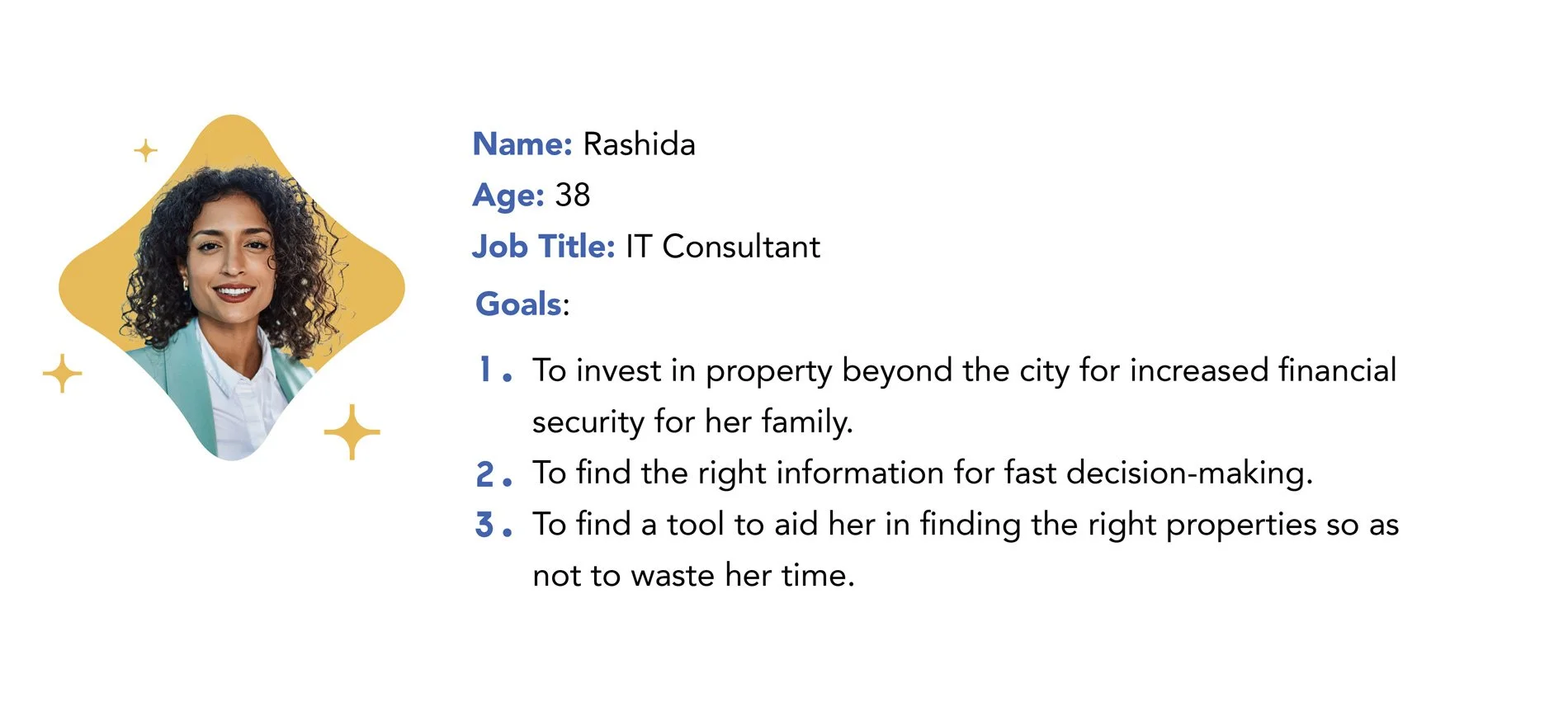
02. USER PERSONA
Rashida is my user persona and the inspiration behind the product. It was with her in mind that I developed my product.
“I want to provide my family with financial security. I’ve been considering buying property for a while, and looking for a tool that can help me find what I’m looking for, quickly!”
03. USER STORIES
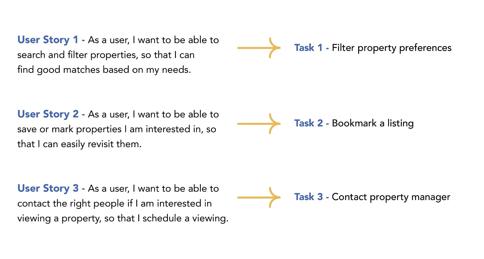
These are the user stories and tasks provided to me.
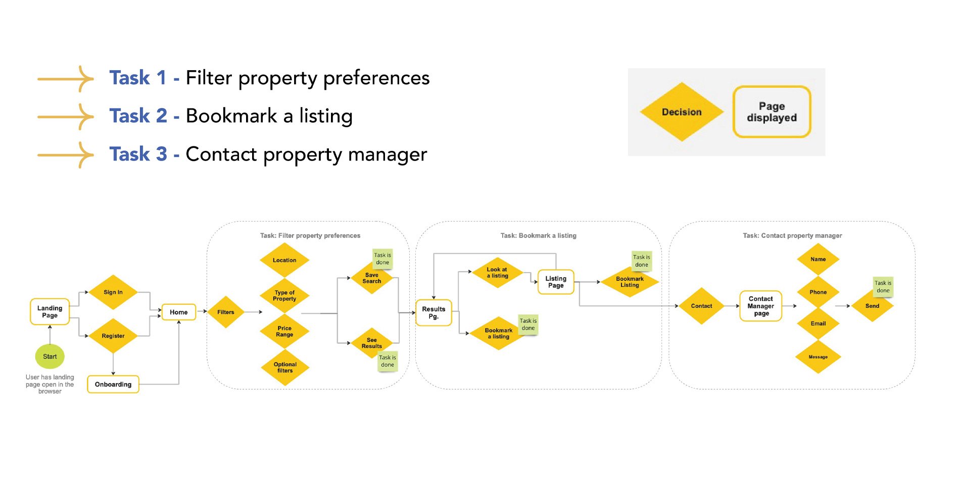
03. USER FLOW
With the user stories and tasks provided I created this user flow, which shaped the navigation necessary to conceive the first steps of the actual design phase shown in step four.
05. LO + MID-FI WIREFRAMES
With the user flow all done, I then proceeded to set the design phase in motion. First, I drew simple low fidelity wireframes which allowed to map out the shell of the mobile interface.
Below are some of the (oh, so many) low-fi screens I sketched out.
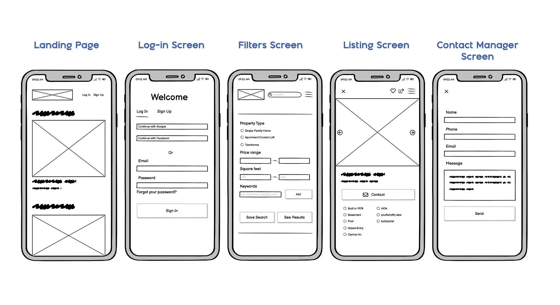
LO-FI WIREFRAMES
MID-FI WIREFRAMES
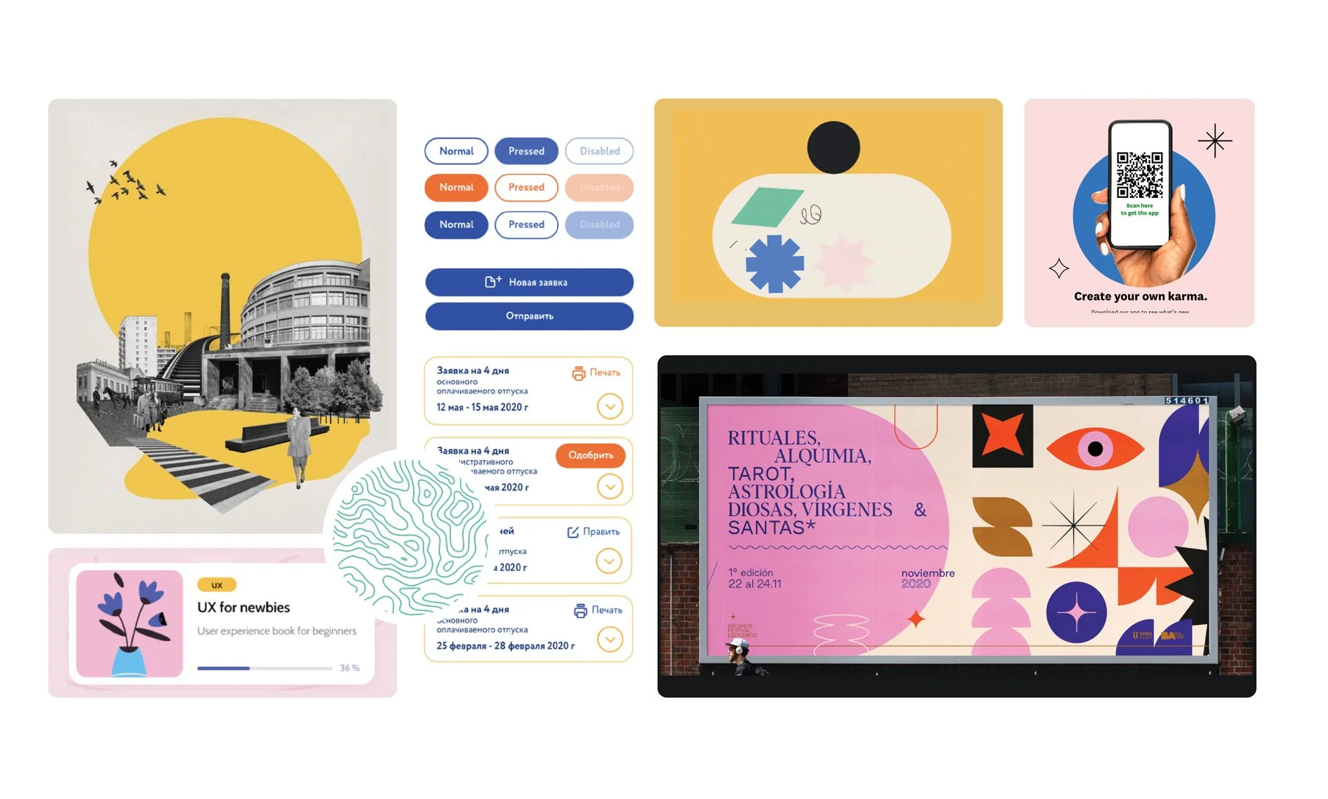
06. MOODBOARD
Before working on the high-fidelity wireframes I needed to create a moodboard to set the tone of the product, so based on the brief, its goals and my own vision of the project, I start collecting everything that evoked the mood I wanted to see in my designs and collected them into the moodboard you see below.
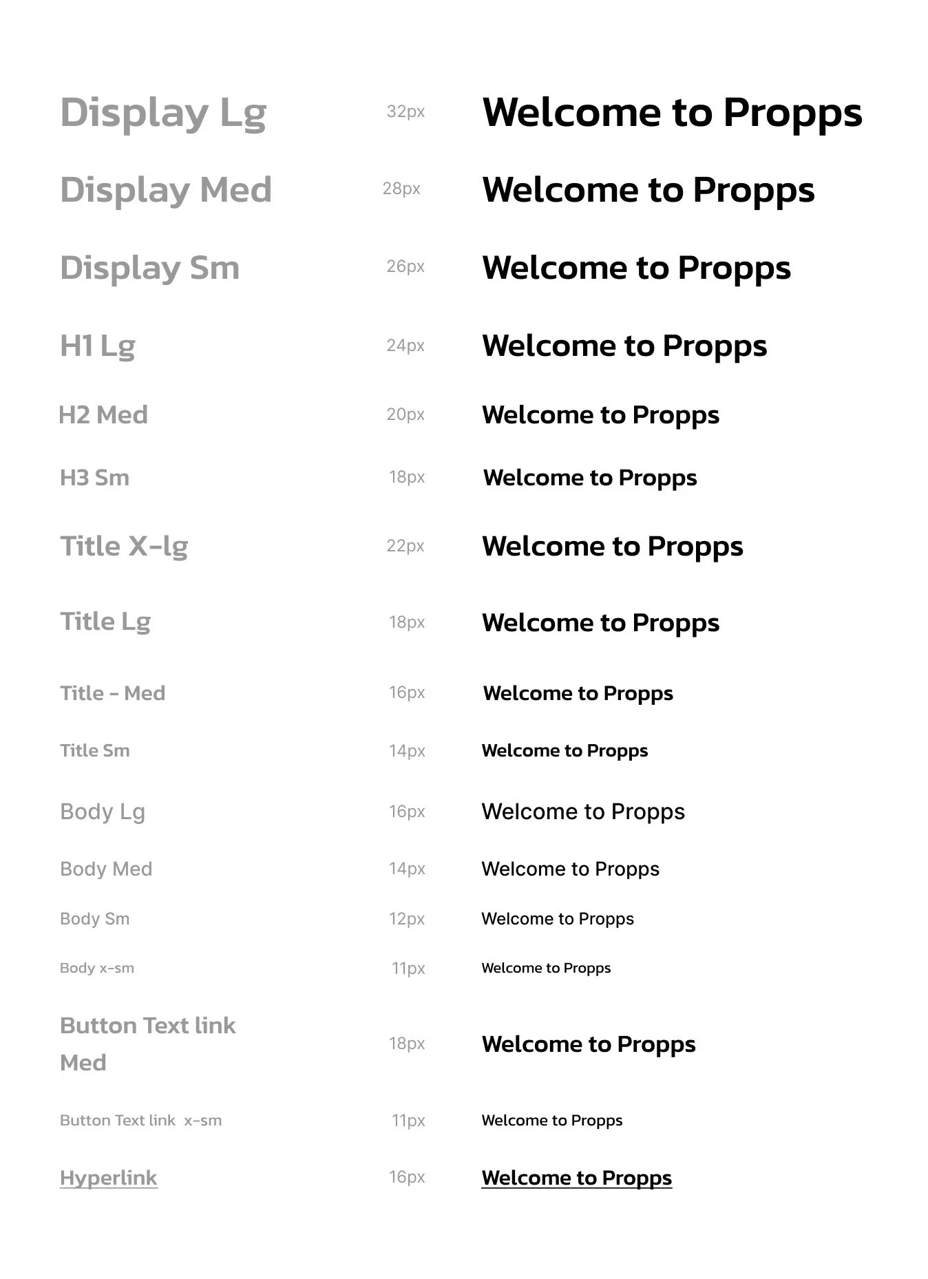
07. STYLE GUIDE
Kanit is the primary brand font in style medium.
The secondary font used in most of the body copy and entry form samples is font Inter in its medium style.
TYPOGRAPHY
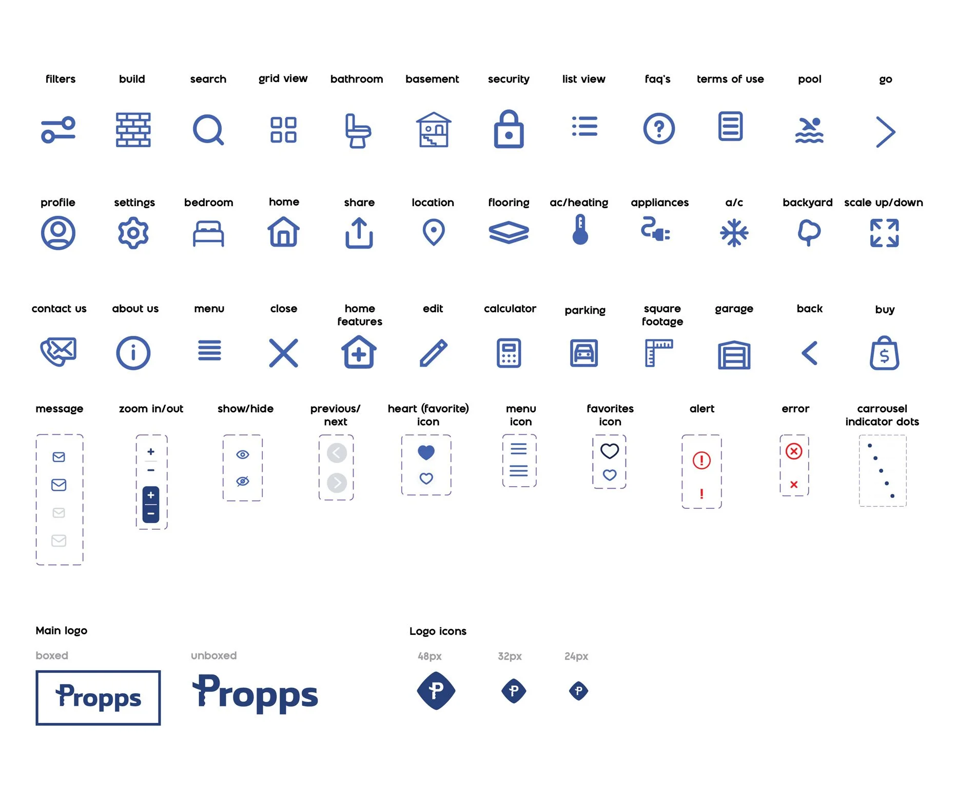
Lapis lazuli light is the default state color for most icons, but in some instances it will be in neutral 2, lapis lazuli dark or red.
Icons have a stroke of 1.75.
The color for the main logo is Lapis lazuli, and the logo icons is Lapis lazuli light.
Icon sizes:
Smallest icon size: 20px
Medium icon size: 24px
Large icon size: 48px
X-Large icon size: 96px
ICONS AND LOGO
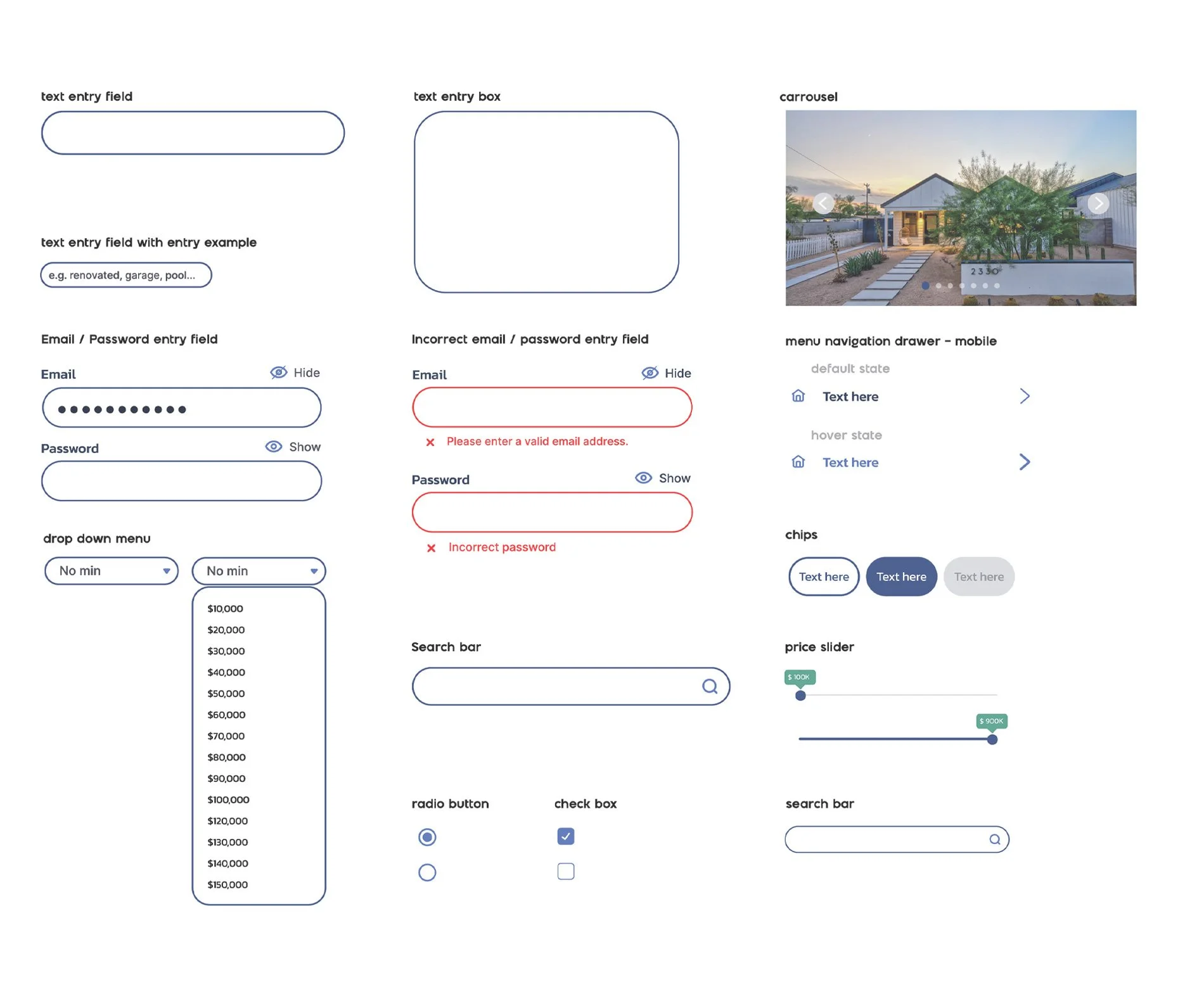
UI ELEMENTS
Entry fields have a corner round-ness of 40 and a stroke with a thickness of 1.75.
Sample text inside text entry fields is in font Inter Medium.
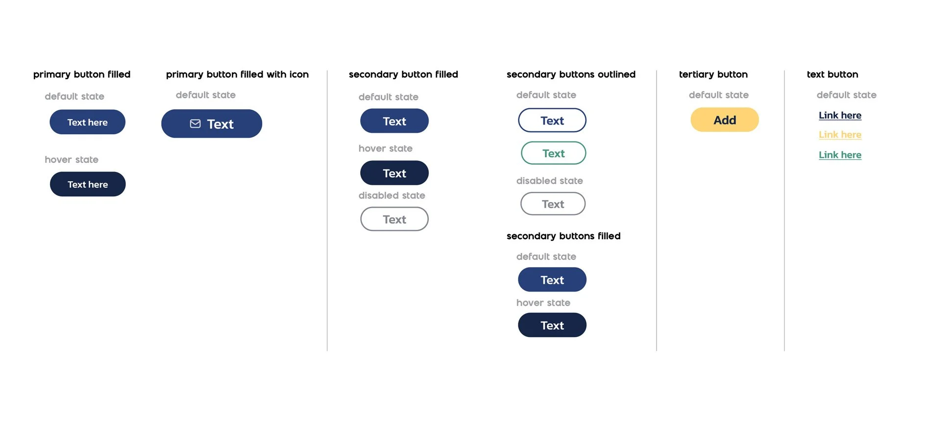
The size of buttons will vary based on the screen they’re been displayed on. These are the buttons developed so far for mobile screens.
BUTTONS
COLORS
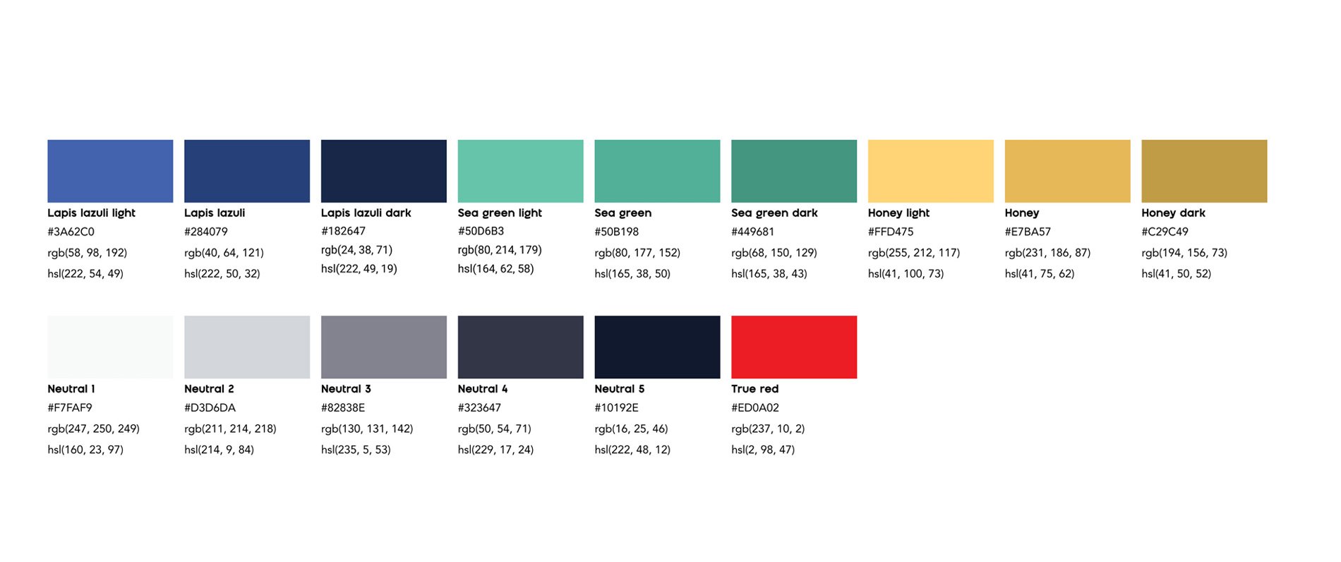
These are all the colors used in the Propps brand.
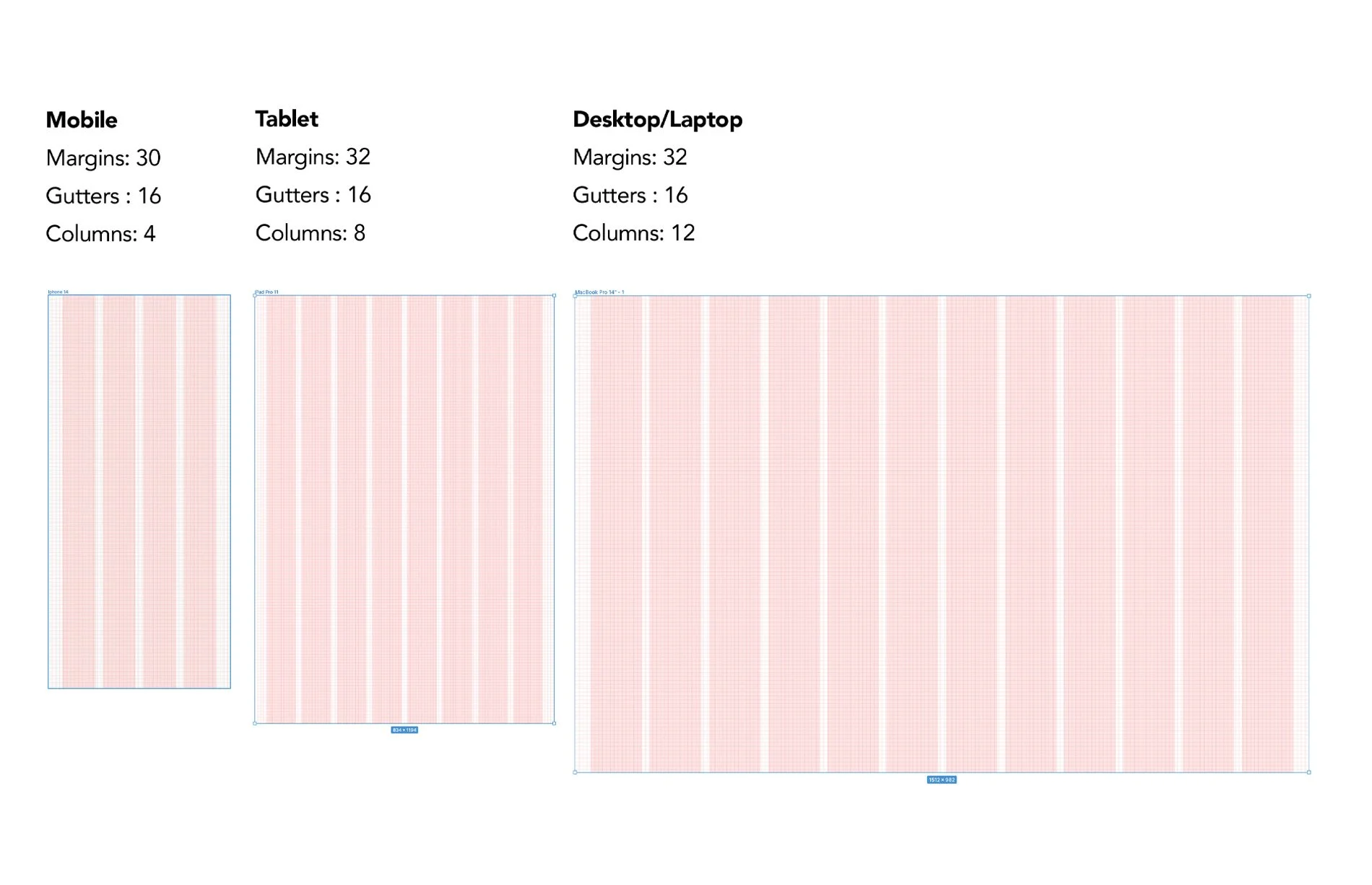
GRID SYSTEM
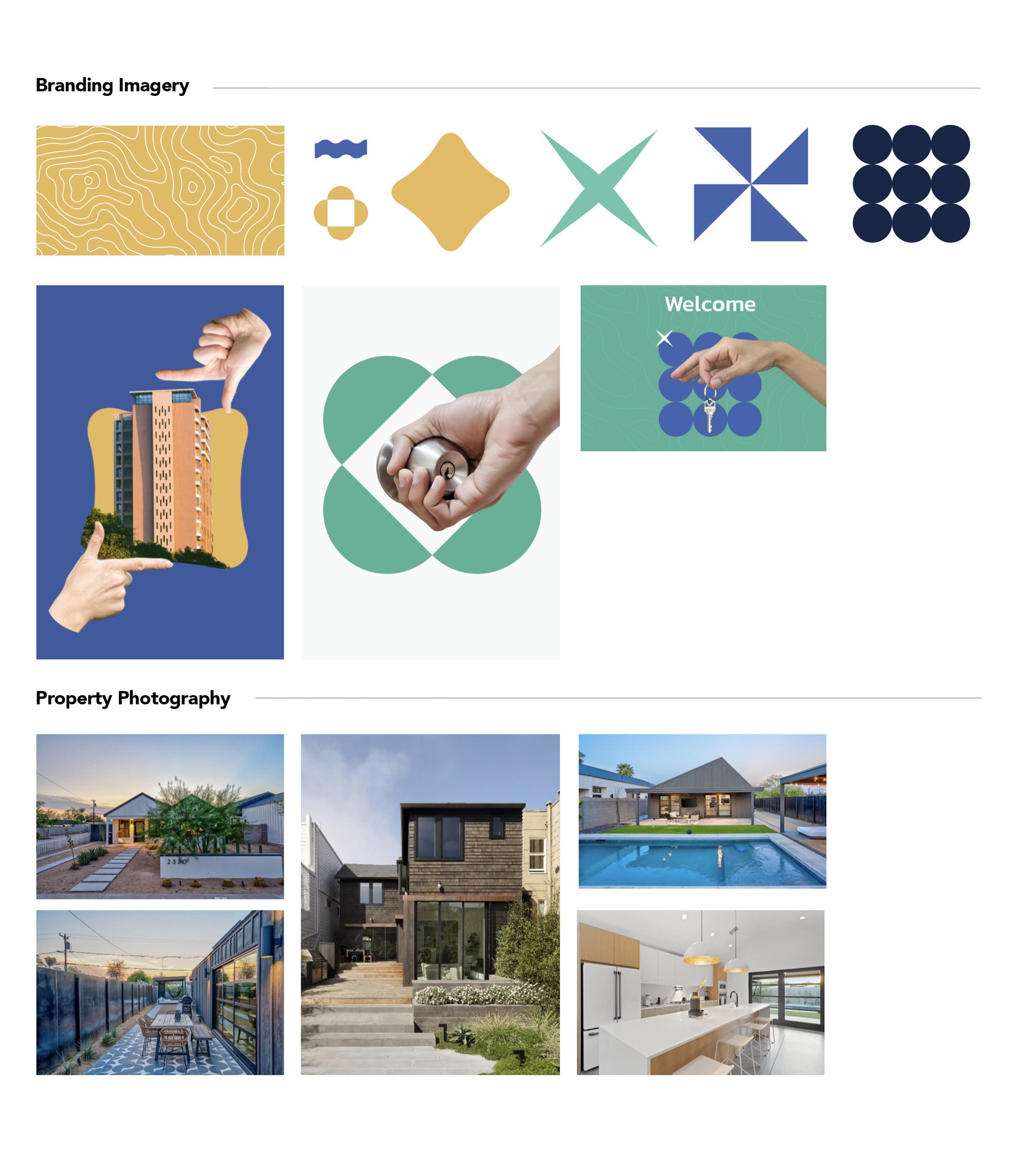
A clean, minimal, bold and modern layered collage style is the main brand style. Maintain clean sharp edges in the collage elements, without drop shadows, or use of filters of any kind.
By creating clean, but eye-catching and unexpected imagery, we aim to convey the pleasing surprises our audience will find and ideally associate with Propps.
Shapes and textures as the ones shown here are part of the style we want to conserve.
When showcasing properties, the photography should feel spacious, clean, taken at eye-level, and be non-digitally manipulated. Stay away from computer-generated or staged (“stock”) photography and do not have people in it.
IMAGERY
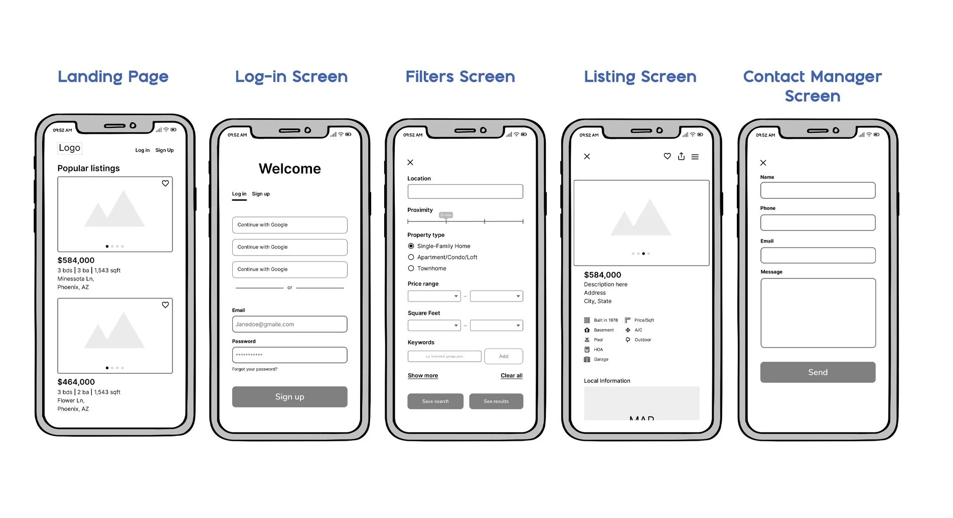
08. HI-FI WIREFRAMES
Once each high-fidelity wireframes for all the screens for mobile were developed, and I had established my grid system for the the other two devices’ different breakpoints (desktop and tablet), I was able to create the low and mid-fidelity wireframes for desktop and tablet.
Below are the finished high-fidelity screens for the main features of the product.
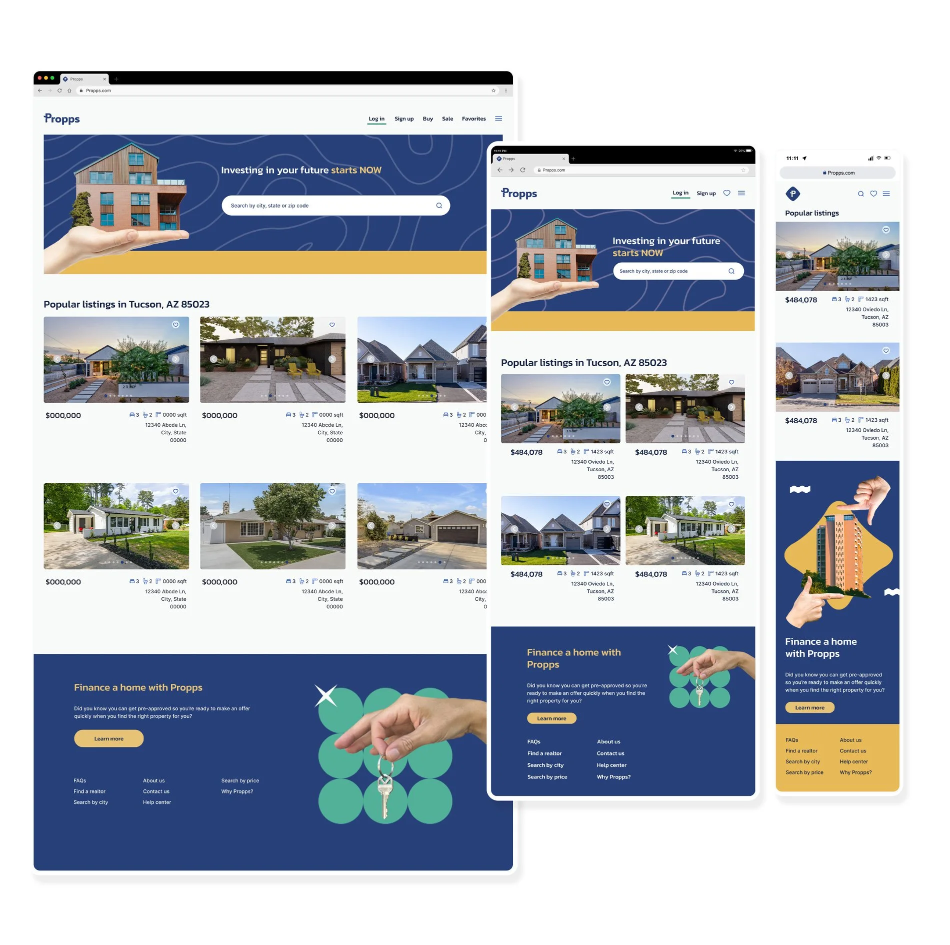
HOME PAGE
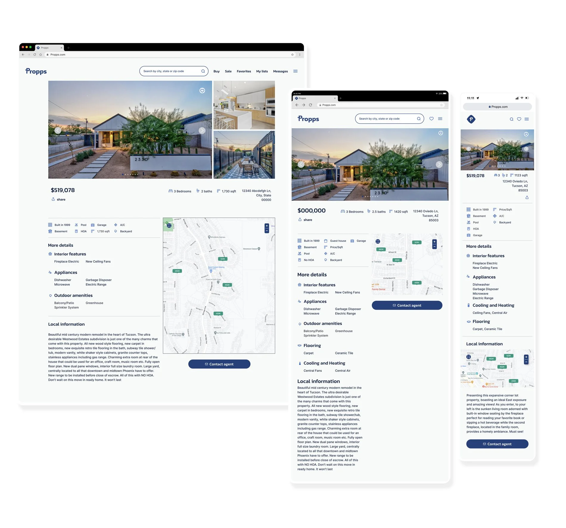
LISTINGS PAGE
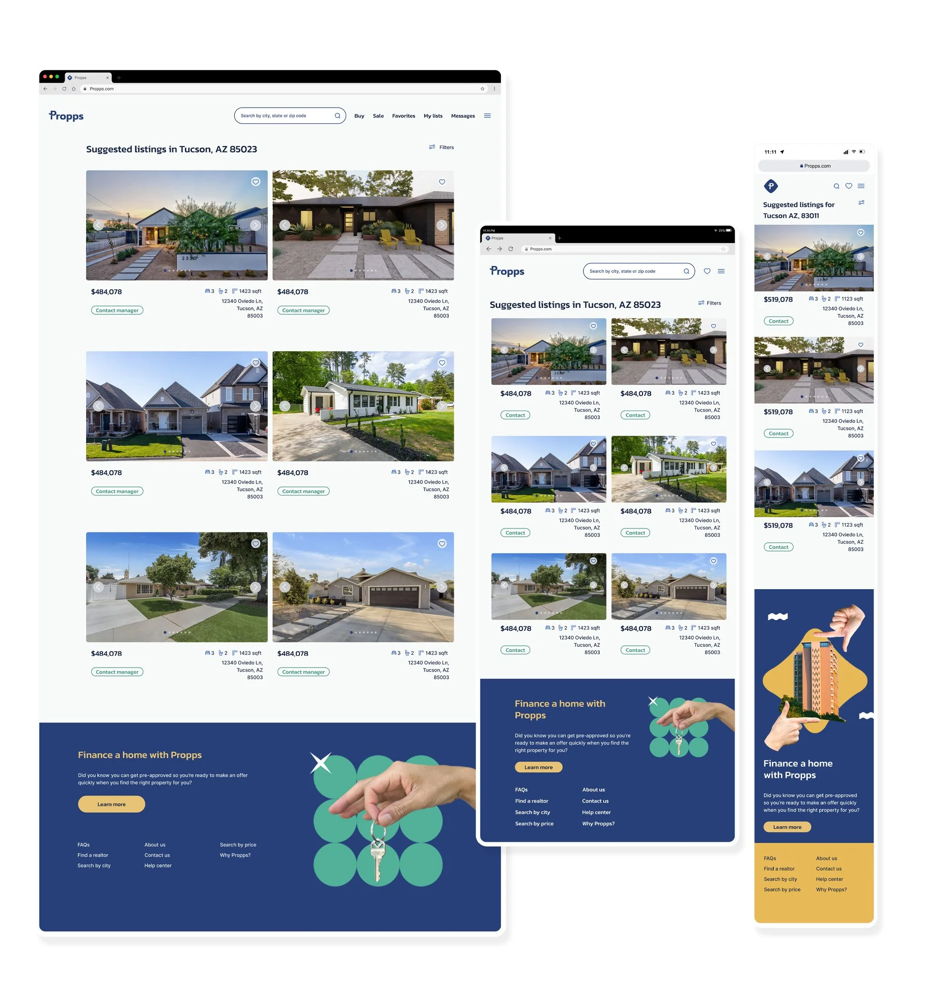
RESULTS PAGE
09. PROTOTYPE
TAKEAWAYS
Every single component of the project plays a significant role in the process.
For example, the lack of a user persona results in unclear design direction, making navigation challenging. Absence of color and design pattern research leads to the absence of a clear style guide, crucial for future designers and developers. In essence, each component significantly supports the others in the design process.
Never stop learning
This field is an ever-changing field and there is never a shortage of new things to learn, so the UI designer doing its due diligence to keep on top of current tools and trends is paramount to a successful career.
Clarity, honesty and communication are essential in the process
UI designers need to be very clear, honest and communicate often and well with the rest of the team in order to produce a good product. For example, understanding what and how to hand off deliverables to the developers, as well as asking questions to the team is absolutely important.